🔥 Design Webflow sites with AI
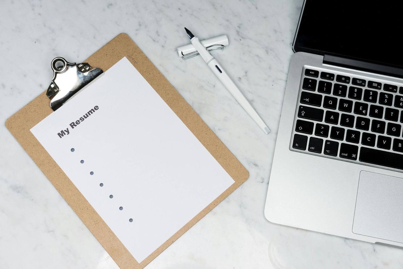
If you’ve ever polished your resume for hours only to feel something still looks off, you’re right – typography can make or break first impressions. Even an AI homework helper won’t save a resume built on weak visual choices.
Fonts do their own storytelling before recruiters read a single word. They set the tone, draw attention, and influence how your skills are perceived.
With the right typeface, your resume looks confident and is easy to scan. With the wrong one, it sends mixed signals. Let’s look at the fonts that look as if they are made for resumes.
Typography guides the eye. A good font for resume layouts helps recruiters absorb information quickly without friction. Most hiring managers skim, and fonts with overly thin strokes, tight spacing, or decorative shapes slow them down.
Professional typefaces balance readability, space efficiency, and personality in ways that make you look intentional and organized. Think of your resume as a quiet introduction. Your font is the opening handshake.
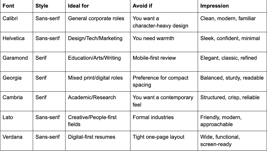
Calibri leads the list because it works almost everywhere. Its rounded shapes and balanced proportions keep your resume clean and readable.
Ideal when:
You want a dependable choice that complements any layout.
Avoid when:
You’re aiming for a distinctive visual identity in a creative field.
Calibri remains an easy pick when choosing the best font to use for resume pages that lean toward clarity over personality.
Helvetica strips away distractions. Its geometry, spacing, and clean presence give your resume a sharp, contemporary feel.
Ideal when:
You work in design, tech, marketing, or any field where visuals matter.
Avoid when:
Your industry expects a more traditional tone.
Helvetica works well when deciding what font is best for resume layouts that need polish without ornamentation.
Garamond adds subtle refinement. Its soft serifs and smooth rhythm create an elegant reading experience suitable for traditional or creative fields.
Ideal when:
You’re in education, arts, writing, or research-heavy roles.
Avoid when:
Your resume will be viewed mostly on mobile.
Garamond provides a polished, literary feel and serves well as a professional font for resume layouts that showcase depth and thoughtfulness.
Georgia keeps serif warmth while improving screen clarity. Wider spacing and sturdy forms make it versatile for both print and digital formats.
Ideal when:
Your resume blends detailed sections with open space.
Avoid when:
You need a tight, condensed layout.
Georgia handles small sizes well and can often support the smallest font for resume sections while staying readable.
Cambria was crafted for structured reading and performs beautifully in resumes with detailed experience, achievements, or publications.
Ideal when:
You’re applying in academia, research, analytics, or roles that involve technical writing.
Avoid when:
You want a contemporary or expressive look.
A size font for resume set between 10.5 and 12 keeps Cambria at peak readability.
Lato adds personality without sacrificing clarity. Its rounded forms and generous spacing give your resume a modern, approachable voice.
Ideal when:
You’re applying to creative, communication, HR, or people-centered roles.
Avoid when:
A conservative, traditional presentation is expected.
An 11-point standard font size for resume layouts usually works best with Lato.
Verdana was built for screens. Larger letters, wide counters, and clear spacing make your resume easy to skim on any device.
Ideal when:
Your resume will be read primarily as a PDF or on smaller screens.
Avoid when:
You need a compact one-page layout.
Verdana maintains readability even at a 10-point minimum font size for resume formats.

Consider the best-fit scenarios and the impression each typeface creates so you can filter your options quickly.
Here’s how to decide which font is best for resume perfection.
Fonts tell stories silently. Your choice can convey competence, clarity, and personality before a recruiter even glances at your achievements.
The best resume font supports your story without drawing attention to itself. Calibri, Helvetica, Garamond, Georgia, Cambria, Lato, and Verdana each offer something unique for different industries and layouts.
Choose based on readability, tone, and the impression you want to make. Test how your resume looks in print and digital form, keep spacing consistent, and trust your eye. Your font is part of your professional identity, and the right one helps your achievements shine with clarity and confidence.