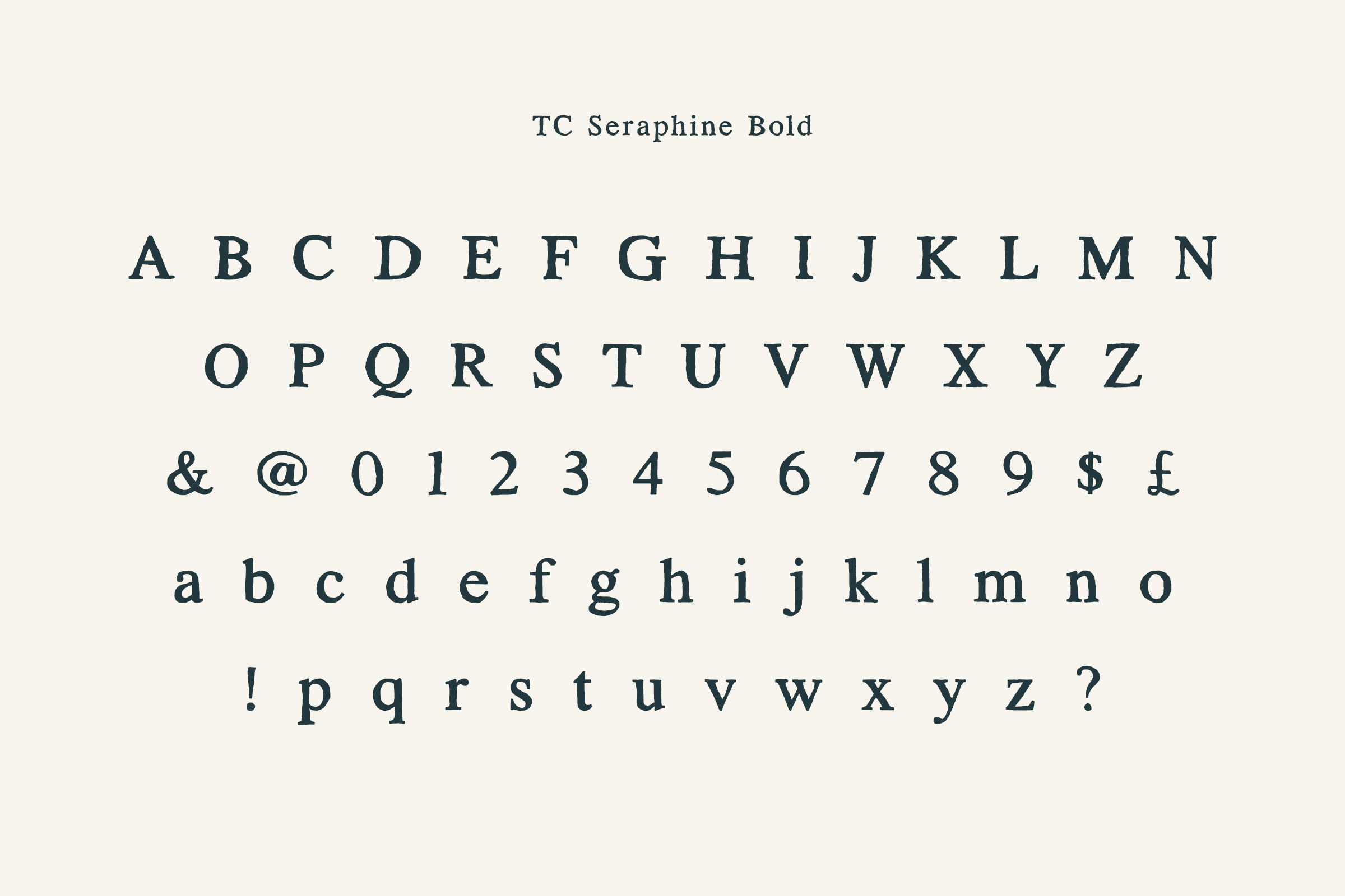
For decades, Times New Roman has been the undisputed king of academic typography. It is the safe harbor for everything from freshman English composition to doctoral dissertations. However, sticking strictly to this default can sometimes work against you. Designed for narrow newspaper columns in the 1930s, it is not optimized for double-spaced A4 pages or high-resolution monitors. Today, other "safe" fonts command respect while offering superior readability.
The choice of typeface is an exercise in clarity. When you present complex ideas, you want the medium to disappear so the message stands out. Just as you might seek accounting assignment help by professionals to ensure that intricate data is presented with absolute precision, you should choose a font that ensures your arguments are deciphered without eye strain. A clean, professional typeface signals to your professor that you care about the reader's experience, potentially removing subconscious friction before they even grade your first paragraph.
Typography is not just about aesthetics; it is about cognitive load. "Legibility" refers to how easy it is to distinguish one letter from another, while "readability" is about how easily the eye flows across lines of text. A font with poor readability forces the professor's brain to work harder just to process the visual information, leaving less cognitive energy for your actual arguments.
This is where the "Serif vs. Sans Serif" debate enters the academic sphere.

If you want to maintain the classic academic look but want something more sophisticated than the default, two primary options are universally accepted.
Garamond is often cited by designers and publishers as one of the most elegant typefaces available. It is lighter and airier than Times New Roman, giving your page a more refined, literary feel. Because the characters are slightly smaller, it often allows you to fit more text on a page without it feeling cluttered. It suggests a level of sophistication and is a favorite in humanities departments.
Georgia was designed specifically for screen readability. It has a larger "x-height" (the height of lowercase letters like a, c, and x) than Times New Roman, making it feel open and friendly. If you know your professor will be grading your paper on a laptop or tablet, which is increasingly common, Georgia is arguably the best tactical choice. It retains the formality of a serif but is optimized for digital display on a pixel screen.
For years, sans-serif fonts were forbidden in strict academic circles, but that has changed. The APA (American Psychological Association) 7th edition manual now explicitly permits fonts like Calibri, Arial, and Lucida Sans Unicode.
Raymond Miller, a writer with a background in Business and English who contributes to the DoMyEssay blog, emphasizes that this shift reflects the changing nature of how we consume text. In his work within the essay writing service industry, Miller notes that business and science papers are increasingly moving toward sans serif fonts because they look cleaner in charts, graphs, and headers. Miller suggests that for technical papers, a clean sans serif like Arial can make dense information feel less intimidating.
Before you highlight your entire document and hit "change," you must verify the specific constraints of your assignment. While most professors are reasonable, some are traditionalists who view anything other than Times New Roman 12pt as a deviation from the rules.
Follow this simple checklist before submitting:
Your goal is to present your hard work in the best possible light. While Times New Roman is never a wrong choice, it is rarely the best choice for visual clarity. By switching to a robust alternative like Georgia for screen reading or Garamond for printed papers, you subtly enhance the presentation of your work. You are making it easier for your professor to say "yes" to your arguments by making them effortless to read.