
The Evolution of Brand Typography: Trends Every Designer Should Know in 2025
May 18, 2026
The Evolution of Brand Typography: Trends Every Designer Should Know in 2025
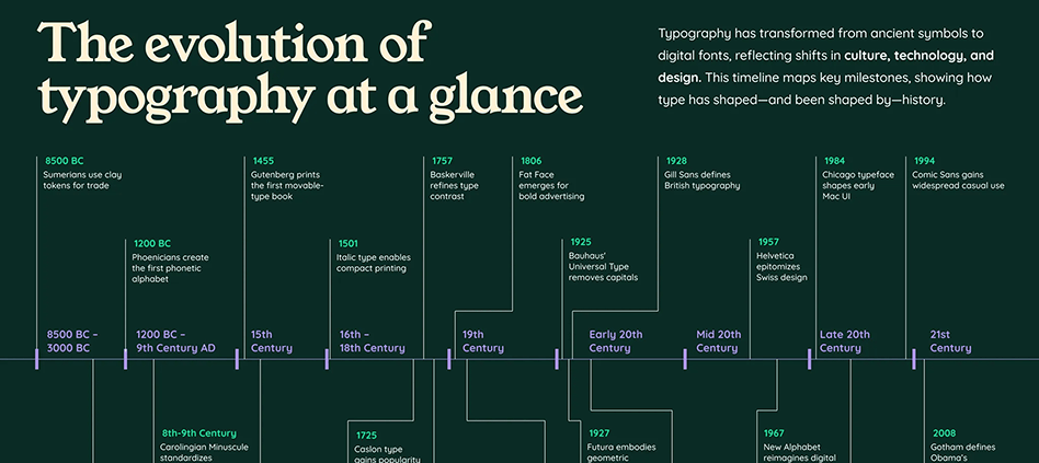
Typography doesn't just communicate words; it shapes entire brand identities and cultural movements. From Coca-Cola's ribbon-like cursive introduced in 1887, which after minor tweaks remains central to the brand's identity today, to Google's recent shift to a custom sans-serif, brand typography tells the story of how we communicate, connect, and perceive quality.
What makes typography evolution fascinating is how it reflects broader cultural shifts. The bold, geometric fonts of the Art Deco era mirrored society's optimism about technology and progress. Today's variable fonts and adaptive typography respond to our multi-device, personalized digital world. Understanding this evolution isn't just design history; it's the roadmap for creating brands that resonate with contemporary audiences.
The Historical Context: How Brand Typography Evolved
The Industrial Revolution: Typography Gets Commercial
The arrival of mechanistic typography coincides with the Industrial Revolution at the beginning of the 19th century. Increased commerce and large-scale improvements in the mechanized printing process post-1811 meant that new typefaces were needed to fill the void. This period marked typography's transformation from purely functional communication to a tool for brand differentiation.
Early brand typography focused on legibility and authority. Banks used heavy serif fonts to convey stability, while manufacturers embraced bold sans-serif types that could reproduce clearly on packaging and advertisements. The emphasis was distinctly practical; fonts needed to work across multiple printing technologies and scales.
Mid-20th Century: Typography Becomes Identity
The 1950s-70s witnessed typography's maturation as a brand strategy tool. Swiss design principles introduced systematic approaches to typeface selection, while advertising agencies began commissioning custom fonts for major clients. This era established typography as intellectual property; brands realized that unique fonts created competitive advantages.
Helvetica's 1957 introduction revolutionized corporate identity. Its neutral clarity appealed to brands wanting to appear modern and trustworthy without a distracting personality. IBM, American Airlines, and countless others adopted clean sans-serif approaches that defined "professional" aesthetics for decades.
Digital Revolution: Democratization and Experimentation
After years of hand-lettering, the invention of the computer simplified the typography process. Now, in the 2000s, designers everywhere can create digital typefaces and fonts. Programs like Adobe Illustrator make it possible to mirror and duplicate strokes or create crisp, straight lines. This technological shift democratized font creation while introducing new technical constraints and possibilities.
The early web forced typography compromises; limited font choices and poor screen rendering meant many brands developed separate digital and print identities. However, these constraints also sparked innovation in web-safe typography and pixel-perfect font design.
Current Typography Trends Shaping Brand Design
Ephemera-Inspired Nostalgia
Ephemera-inspired typography is expected to gain traction in 2025, with more creatives turning to vintage items like postcards, tickets and packaging for inspiration. As brands seek to evoke authenticity and nostalgia, designers are embracing fonts with historical character. This trend reflects consumers' desire for authentic, human connection in an increasingly digital world.
Brands are mining typography history for fonts that feel handcrafted and personal. Distressed textures, imperfect baselines, and irregular letter spacing create warmth that contrasts with digital perfection. However, successful implementation requires balancing nostalgia with contemporary functionality; vintage-inspired fonts must still work across digital platforms.
Art Deco Renaissance
Art Deco never really went away. But in 2025, it's getting a major upgrade. Those classic geometric shapes and luxurious curves are being reimagined with modern twists. Less Great Gatsby, more neo-luxury. And brands are eating it up. This revival speaks to brands seeking sophisticated differentiation in crowded markets.
Modern Art Deco typography combines the era's geometric precision with contemporary functionality. With its geometric shapes and refined, elongated forms, this trend offers a touch of glamour, elegance, and a dash of vintage flair that appeals to luxury brands and premium services wanting to convey both heritage and innovation.
Retro-Inspired Serifs Making Comeback
Retro-inspired serifs are making a comeback, blending nostalgic charm with modern flair. Think classic newspaper headlines but with a contemporary twist in spacing and proportions. This trend represents a reaction against decades of sans-serif dominance, particularly in digital contexts.
These updated serif fonts maintain classical authority while offering improved screen readability. Brands use them to stand out in sans-serif-saturated markets, particularly in sectors like media, publishing, and professional services where credibility and expertise matter most.
3D and Dimensional Typography
3D typography has been on the rise, but in 2025, we're seeing an evolution toward "inflated" or dimensional styles that create visual impact across social media platforms. This trend leverages improved rendering capabilities and audience appetite for eye-catching visuals.
Dimensional typography works particularly well for brands targeting younger demographics who consume content primarily through social platforms. The challenge lies in maintaining legibility while creating a memorable visual impact that translates across various media applications.
Strategic Implications for Brand Designers
Beyond Aesthetics: Typography as Brand Strategy
Typographic design in 2025 isn't just about style; it's about strategy, personality, and creating emotional impact through type. Modern brand typography requires strategic thinking that balances aesthetic trends with business objectives and audience psychology.
Successful typography strategies consider long-term brand evolution rather than following short-term trends. The most effective brand fonts create distinctive voice while maintaining flexibility for future applications and market changes.
Multi-Platform Typography Systems
Contemporary brand typography must work seamlessly across digital platforms, print materials, packaging, signage, and emerging media formats. This requires systematic approaches that define font hierarchies, sizing scales, and adaptation rules for various contexts.
Variable fonts represent a significant advancement in this area, allowing single font files to adapt weight, width, and style based on application needs. This technology enables more consistent brand expression while reducing technical complexity and file sizes.
Cultural Sensitivity and Global Considerations
As brands expand globally, typography choices must consider cultural associations and reading patterns across different markets. Fonts that convey authority in Western contexts might appear aggressive in other cultures, while script fonts may have different gender associations across regions.
Successful global brands develop typography systems that maintain core brand personality while adapting to local preferences and technical requirements. This might involve commissioning custom fonts for specific markets or developing comprehensive font families with regional variations.
Practical Applications for Modern Designers
Trend Integration Without Trend Following
The key to successful typography trend adoption lies in selective integration rather than wholesale following. Analyze how current trends align with your brand's core personality and long-term strategic objectives before implementation.
Consider trends as tools for achieving specific communication goals rather than aesthetic choices. Ephemera-inspired fonts might strengthen a craft brewery's authenticity story, while geometric Art Deco styles could differentiate a financial technology startup in a crowded market.
Future-Proofing Typography Choices
Design typography systems that can evolve with technological advances and changing brand needs. This involves creating comprehensive style guides that address current applications while maintaining flexibility for future platforms and media formats.
Document the reasoning behind typography choices to guide future brand decisions. Understanding why specific fonts were selected helps maintain consistency during team changes and brand evolution periods.
Balancing Innovation with Functionality
While typography trends offer opportunities for brand differentiation, functionality must remain paramount. The most innovative typography serves the brand's communication objectives while providing excellent user experience across all touchpoints.
Test typography choices across various applications, sizes, and contexts before final implementation. What works beautifully on a website hero section might fail at small sizes or in poor lighting conditions on packaging.
Tools and Technologies Shaping Typography's Future
Variable Fonts and Adaptive Typography
Variable font technology allows single font files to adapt characteristics like weight, width, and slant based on context. This innovation enables more sophisticated typography systems while reducing technical complexity and improving loading performance.
Smart typography systems can automatically adjust font characteristics based on screen size, reading distance, and user preferences, creating more accessible and personalized brand experiences.
AI-Assisted Font Creation and Customization
Artificial intelligence tools are beginning to assist in font creation, analysis, and customization. These technologies can generate font variations, analyze readability across different contexts, and suggest improvements based on usage data.
However, AI augments rather than replaces human typographic expertise. The most successful implementations combine technological capabilities with human understanding of brand strategy, cultural context, and aesthetic judgment.
Final Thoughts & Call to Action
The evolution of brand typography reflects our changing relationship with communication, technology, and visual culture. Today's typography trends aren't just aesthetic choices; they're responses to how audiences consume content, how brands build relationships, and how technology enables new forms of expression.
Understanding typography evolution helps designers make informed choices that balance current relevance with lasting impact. The brands that succeed are those whose typography choices feel both contemporary and timeless, trendy yet authentic to their core identity.
As we move through 2025, typography will continue evolving in response to new technologies, cultural shifts, and communication needs. The designers who understand both historical context and emerging trends will create the most effective and memorable brand identities.
Ready to evolve your brand's typography strategy? Start by analyzing your current font choices against historical context and emerging trends. Consider how typography trends align with your brand personality and communication objectives. For the latest industry insights into typography evolution, explore Monotype's annual Type Trends Report, which analyzes how typography responds to cultural forces and technological advances.
