
Logo Fonts 101: How to Choose the Right Typeface for Your Brand in 2025
May 18, 2026
Your logo font isn't just text; it's your brand's voice before you say a word. Within milliseconds, potential customers form judgments about your business based on the typeface you choose.
Typography is way more than just choosing a pretty font; in fact, it's one of the most important elements in creating a perception and experience for your brand.
Yet most businesses treat font selection as an afterthought, picking whatever looks "nice" without considering what message they're actually sending. The difference between a font that builds trust and one that screams amateur can make or break your brand's first impression. Understanding logo typography isn't just design knowledge; it's business strategy.
Why Logo Font Choice Matters for Your Brand
The typefaces you choose can have a huge impact on the way your brand communicates. After all, it's not just what you say: It's how you say it. Your logo font works 24/7, appearing on everything from business cards to billboards, websites to product packaging.
Consider the psychological impact: a law firm using a playful script font undermines credibility, while a children's toy company with stern, corporate typography feels cold and unapproachable. If your business is "authoritative" or "educational," you may want to choose a transitional serif typeface. If you're "quirky" or "whimsical," a script font might be for you.
The stakes are higher in 2025's competitive landscape. Consumers interact with hundreds of brands daily through digital touchpoints. Your logo font needs to work across Instagram stories, mobile apps, email signatures, and traditional print, all while maintaining brand recognition and emotional connection.
Understanding the Four Main Logo Font Categories
Serif Fonts: Traditional Authority
Serif fonts feature small decorative strokes extending from letter forms. Think Times New Roman, but modern serif options offer sophistication without stuffiness. Brands like Vogue, The New York Times, and Tiffany & Co. leverage serif fonts to convey heritage, elegance, and trustworthiness.
Best for: Law firms, luxury brands, financial services, publishing, and high-end restaurants
Emotional associations: Trustworthy, established, refined, academic
Sans Serif Fonts: Modern Clarity
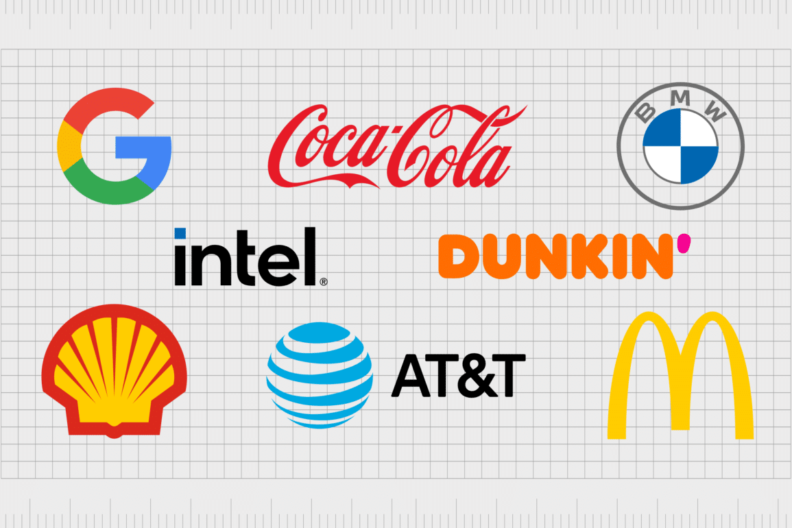
If you want to create a clean and minimalist look for your logo, then you should probably go with some sort of a sans-serif typeface. Some of the famous brands that use sans serif fonts in their logos are: Intel, Airbnb, Flickr, Nutella, Dropbox, MasterCard, Ebay, Adidas, and the new Google.
Sans serif fonts eliminate decorative strokes for clean, straightforward communication. They're incredibly versatile and work well across digital platforms where readability is paramount.
Best for: Tech companies, healthcare, startups, fitness brands, modern services
Emotional associations: Clean, efficient, approachable, contemporary
Script Fonts: Personal Connection
Script fonts mimic handwriting or calligraphy, ranging from elegant formal scripts to casual handwritten styles. They add personality and a human touch to brands but require careful consideration for readability across applications.
Best for: Beauty brands, wedding services, artisanal products, personal brands, creative agencies
Emotional associations: Personal, creative, feminine, luxury, handcrafted
Display Fonts: Distinctive Character
Display fonts are designed for headlines and logos, often featuring unique characteristics that make them memorable but potentially limiting. They work best when your brand name is short and the font truly aligns with your brand personality.
Best for: Entertainment, sports teams, unique retail concepts, event brands
Emotional associations: Bold, memorable, specialized, attention-grabbing
Brand Psychology: Matching Font to Personality
Start your font selection by defining your brand's personality with specific adjectives. This exercise prevents emotional decision-making and ensures your typography aligns with strategic positioning.
Traditional/Established Brands: Heritage brands benefit from serif fonts that communicate longevity and expertise. Consider modern serif options that maintain classic associations while feeling current. Trajan Pro works for financial institutions, while Minion Pro offers readable elegance for professional services.
Innovative/Modern Brands: Technology and forward-thinking companies often choose geometric sans serif fonts that feel cutting-edge. Fonts like Futura, Helvetica, or Proxima Nova communicate efficiency and modernity without personality overload.
Creative/Artistic Brands: Creative industries can push boundaries with custom lettering or distinctive display fonts. However, ensure uniqueness doesn't sacrifice legibility. Your logo needs to work at favicon size and massive billboard scale.
Approachable/Friendly Brands: Rounded sans serif fonts like Circular or friendly scripts create warmth and accessibility. Service-based businesses often benefit from fonts that feel human and welcoming rather than corporate and distant.
Technical Considerations for Logo Font Selection
Scalability Requirements
A logo typeface might not be suitable for all applications. Test your chosen font at multiple sizes, from 16px website favicons to large format printing. Thin strokes and intricate details disappear at small sizes, while bold fonts may feel overwhelming when large.
Digital Optimization
Your logo font must render clearly on various screen resolutions and devices. Web-safe fonts ensure a consistent appearance, while custom fonts require careful implementation with proper fallbacks. And it's not just websites. Email is increasingly visual too. Standards like BIMI now let brands display their BIMI logo directly in recipients' inboxes, which means your mark needs to hold up in that context as well.
Licensing and Usage Rights
Free fonts often come with usage restrictions that limit commercial applications. Professional fonts typically cost $20-$200 but include proper licensing for all business uses. Platforms like Adobe Fonts provide access to thousands of licensed fonts with comprehensive usage rights. Consider long-term needs because rebranding due to licensing issues is expensive and confusing for customers.
Font Pairing Strategy
When it comes to choosing brand fonts, it is best to limit yourself to three: one for your heading, one for sub-headings, and one for your body copy. Your logo font should work harmoniously with secondary fonts used across marketing materials, websites, and communications.
Common Logo Font Mistakes to Avoid
Trend Chasing: From a sans-serif backlash to neo-retro revivals, our experts predict a diverse typographic landscape for the coming year. While staying current is important, choosing fonts solely based on trends creates dated logos that require frequent updates.
Overcomplicating: Complex fonts with multiple design elements often fail at small sizes and across applications. Simple, well-executed typography typically outperforms elaborate fonts that sacrifice functionality for visual interest.
Ignoring Industry Context: Understanding your industry's typography conventions helps you either align with or strategically differentiate from competitors. A funeral home using the same playful font as an ice cream shop sends conflicting messages.
Poor Readability: If customers can't easily read your business name, your logo fails its primary function. Test readability with people unfamiliar with your brand. If they struggle to decipher the text, choose something clearer.
Practical Steps for Choosing Your Logo Font
Step 1: Define Brand Personality
List 5-10 adjectives describing your ideal brand perception. Are you trustworthy or innovative? Luxury or affordable? Traditional or cutting-edge? These descriptors guide font category selection.
Step 2: Research Competitor Analysis
Analyze 10-15 competitors' logo fonts using tools like WhatTheFont to identify specific typefaces. Identify patterns and opportunities for differentiation. You want to fit your industry while standing out from direct competitors.
Step 3: Create Font Mood Board
Collect 20-30 fonts that align with your brand personality. Include various styles within your preferred category since not all serif fonts communicate the same message.
Step 4: Test Practical Applications
Apply your top 5 font choices to your actual business name across different sizes and contexts. Create mockups showing business cards, websites, signage, and social media applications.
Step 5: Gather Feedback
Test font options with target customers, not just internal team members. Their perceptions matter more than personal preferences. Use A/B testing for digital applications when possible.
Logo Font Trends and Future Considerations
Ephemera-inspired typography is expected to gain traction in 2025, with more creatives turning to vintage items like postcards, tickets, and packaging for inspiration. As brands seek to evoke authenticity and nostalgia, designers are embracing fonts with historical character.
However, balance trend awareness with timeless appeal. Your logo needs longevity; frequent rebranding confuses customers and wastes marketing investment. Choose fonts that feel current but won't look dated in five years.
Consider variable fonts that adapt stroke weight and width based on application needs. This technology allows one font file to serve multiple purposes while maintaining brand consistency.
Final Thoughts & Call to Action
Choosing the right logo font requires balancing emotional psychology, technical requirements, and strategic brand positioning. Not all fonts are created equal when it comes to logo design. While some typefaces work beautifully for body text or headlines, only a select few have that special "logo DNA" that makes brands instantly memorable and trustworthy.
Your logo font choice echoes through every customer interaction. It appears on invoices, websites, packaging, and marketing materials, silently communicating your brand values and building recognition. Take time to choose thoughtfully rather than quickly.
The perfect logo font exists at the intersection of your brand personality, target audience expectations, and practical application needs. When these elements align, typography becomes a powerful tool for building brand equity and customer connection.
Ready to find your perfect logo font? Start by clearly defining your brand personality, then explore free font options at Google Fonts systematically rather than randomly. Need more branding guidance? Explore our comprehensive brand identity guides and logo design resources.
