🔥 Design Webflow sites with AI
Most DIY book covers don’t fail because the tools are bad. They fail because the decisions are thin.
A cover can look polished and still read “amateur” to the people it’s meant to attract. Professional designers build for the market: genre cues, reader expectations, and instant clarity.
That matters now more than ever. Online storefronts reduce covers to thumbnails, and readers decide fast. Typography, spacing, and restraint do a lot of the persuading long before anyone reads a word.
DIY covers usually begin with a feeling. A mood. An image the author loves. That instinct is understandable, but it can trap you inside your own perspective. A professional book cover designer starts with the reader who’s meant to pick the book up.
Readers carry expectations shaped by genre, price, and patterns they’ve absorbed over years of browsing. A thriller that looks literary, a romance that leans corporate, or a fantasy cover dressed in sparse minimalist type can send the wrong signal before the title even lands. Professionals read those signals fluently. They know which conventions can bend and which ones keep a book from looking out of place.
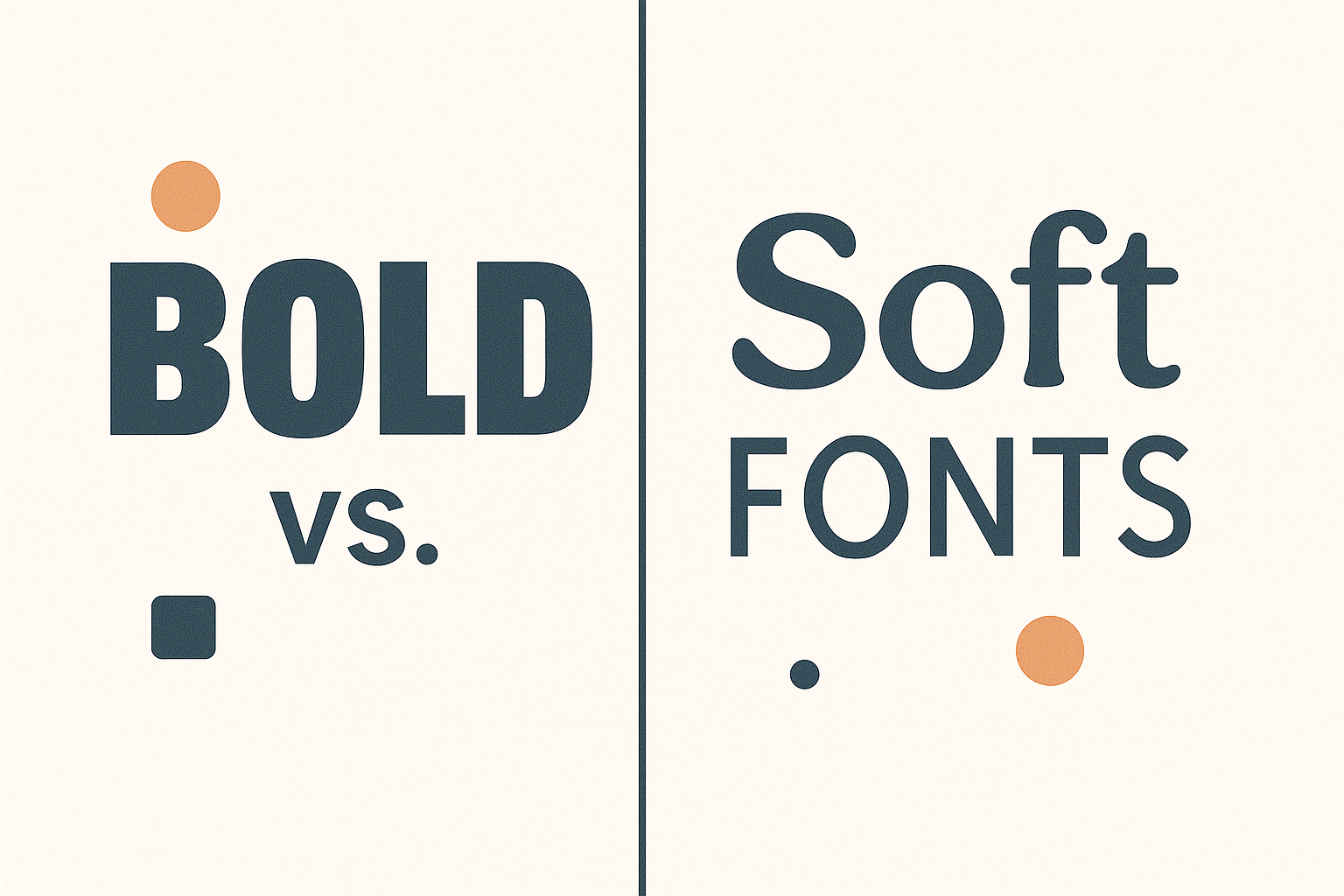
Typography does much of the heavy lifting. Font choice carries assumptions about tone and credibility. A designer isn’t hunting for a typeface that feels “cool.” They’re choosing one that speaks the same visual language as the books the target audience already trusts.
When covers miss, it’s rarely due to a lack of effort. Personal taste simply outweighs reader recognition. The strongest covers step back from self-expression and focus on instant belonging.
DIY covers often treat typography like a final garnish. The image is chosen, the layout feels settled, then the font gets dropped in at the end. Something dramatic, something expressive, something that fills the space. It shows. Type starts fighting the artwork or getting buried, and the cover loses clarity.
Professionals treat typography as structure. It’s an early decision because it shapes everything else: title weight, spacing, the relationship between title and author name, and how much breathing room the layout needs.
DIY covers tend to slip on the small stuff: mismatched fonts, stretched letterforms, display type that looks great full-size and turns to mush at thumbnail scale. None of it is catastrophic, but it’s enough to make a cover feel slightly off, and that’s often all it takes to lose a click.
Strong typography creates order. Weak typography creates friction.
Most book covers are judged at a size no designer would ever choose. A few centimeters wide, viewed in motion, competing with dozens of other covers on the same screen. That reality changes what matters.
DIY covers are often evaluated at full size, where textures feel rich, and details feel intentional. Shrink them down, and the cracks show. Thin type fades out. Decorative fonts blur. Titles lose their shape. What felt dramatic suddenly looks timid or cluttered.
Professionals start small and work outward. They test legibility early. They check whether the title still reads when the cover is reduced to a thumbnail, whether contrast holds, and whether the composition stays intact. If it fails that test, the design isn’t “almost done.” It’s unfinished.
This is also where genre familiarity becomes a strength. Readers process known patterns more quickly when attention is limited. A cover that reads clearly at thumbnail size earns the click. A cover that needs full resolution to make sense usually won’t get the chance.
Design software makes it easy to produce something that looks finished. Fonts are a click away. Layouts snap into place. Alignment errors fix themselves. What software can’t supply is judgment.
A professional treats tools as support, not direction. Every typographic decision has a reason behind it: what the genre signals, how the title performs at thumbnail size, and how much contrast the layout can carry without turning into clutter. Those choices happen before the polishing.
Good design is built on principles that hold up across mediums. Clear hierarchy, visual balance, and restraint shape how quickly a reader understands what they’re seeing and whether it feels credible. Nielsen Norman Group’s breakdown of good visual design reinforces the same point: structure and clarity do the persuasive work when you have seconds to communicate.
DIY workflows often run in reverse. A tool suggests a layout or font pairing, and the cover grows in response. It can end up looking “done” without ever feeling settled. Professionals cut faster, test less, and refine harder until every element earns its place.
Software helps you execute. The gap between DIY and professional shows up in the decisions.
DIY makes sense in specific situations. Early drafts. Personal projects. Short runs where the cover functions as a stand-in rather than a selling tool. In those cases, learning the basics of layout and type can help you spot why a cover feels unstable before you sink hours into refinements.
Hiring a professional becomes the smarter move when the book has a job to do. Commercial fiction. Nonfiction tied to authority. Any release meant to compete in crowded categories where readers decide fast. At that point, the cover is part of the product, and it’s judged accordingly.
A professional doesn’t just arrange elements. They understand how readers interpret visual cues and how small typographic choices influence trust before a single word is read. Weight, spacing, and familiarity shape whether a cover feels legitimate or tentative. Over time, designers learn to recognize patterns in typography that signal credibility because they’ve seen how those choices perform across real books, not isolated mockups.
The real question isn’t whether you can make a cover yourself. It’s whether the cover earns confidence on sight, at thumbnail size, among dozens of competitors. When it does, the writing finally gets a fair shot.