Found the Logo Font? Here Is What to Check Before Using It
A visual match is a starting point, not proof. Here's how to separate the typeface from the identity design, stress-test a candidate font, and clear the license before you ship a wordmark.
September 17, 2026
You find a familiar logo, identify a promising typeface, and type your own brand name. The result looks surprisingly ordinary. That does not necessarily mean the identification was wrong. A logo can depend on a particular weight, alternate characters, carefully adjusted spacing, or letters that were redrawn after typesetting.
The useful question is therefore bigger than “What font is this?” It is: which parts come from the typeface, and which belong to the identity design? This practical investigation takes you from a visual match to a decision you can explain to a client.
Read the match label before downloading anything
Font in Logo distinguishes entries with labels including “Modified,” “Based On,” and “The Closest Font.” Those labels carry different meanings. A nearby visual alternative may be useful for exploration without being the original production typeface. Treat a directory result as a starting point, then look for evidence from the brand, designer, or foundry.
Finding
What it suggests
What remains to check
Exact family identified
A plausible source for the letters
Weight, version, alternates, spacing
Modified or based on
The font supplied a starting point
Which outlines were changed
Closest alternative
A similar visual character
Whether it suits your own name
Custom lettering
A wordmark may be drawn directly
Whether a reusable font exists
Save the reference image with its source and date. An old package, current website header, and anniversary mark may show different versions of an identity. Mixing them creates a false puzzle: no single font setting can reproduce three different designs.
Separate the wordmark from the brand font
A wordmark is one fixed arrangement of letters. A brand font must handle new words in headlines, navigation, packaging, or presentations. A company can use custom lettering for its name and a commercially available family everywhere else. Finding the website font does not, by itself, identify the logo.
Put the candidate on trial with one word
Begin with the exact word in the reference. Match capitalization, then compare the candidate at a similar visible letter height. Equal point sizes do not guarantee equally large-looking letters. Remove shadows, gradients, and surrounding symbols from your assessment so they cannot disguise structural differences.
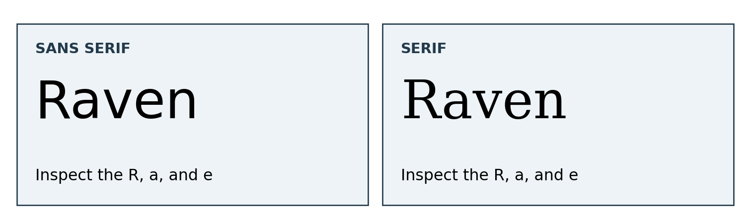
Original comparison using DejaVu Sans and DejaVu Serif. The fictional word is identical; the letter structures differ. Neither sample reproduces a brand logo.
Look at a few distinctive characters rather than the overall mood. Does the lowercase a have one storey or two? Where does the leg of R begin? How open is the e? Then inspect terminals, stroke contrast, and the proportions of round letters. A rounded atmosphere is not enough evidence for an exact match.
Change one variable at a time
Try the appropriate weight and available alternates before editing outlines. Adjust overall tracking, then inspect individual pairs. If the reference differs mainly in spacing, replacing the whole family may solve the wrong problem. If the letter skeletons differ, squeezing the candidate horizontally will usually add distortion rather than accuracy.
Use three short checks:
Compare distinctive glyphs before judging the complete silhouette.
Check spacing at the intended output size, not only while zoomed in.
Keep a note of every alternate, weight, and manual adjustment.
A frequent mistake is choosing a font because its capital A matches beautifully while ignoring the rest of the name. Another is applying the same tracking value to every wordmark. Different combinations of diagonals, verticals, and curves create different apparent gaps. The finished word needs optical review, even when the font has good kerning.
When a close match is still incomplete
PetChoy provides a concrete example of a retail family becoming a specialized brand asset. MO NO DESIGN commissioned a customized TT Trailers Bold for the pet-food project. TypeType added Vietnamese glyphs and developed traditional and animal-inspired diacritics. The resulting files were TT Trailers Petchoy and TT Trailers Petchoy Display.
The published case includes “hinting of new characters” among the tasks and describes subsequent kerning work. That matters: customization involved production details as well as playful shapes. Identifying TT Trailers as the starting family would not reproduce every feature of the commissioned files. This is a brand-typeface example, not proof that every letter of the PetChoy logo comes directly from the retail font.
For a new identity, use the specimens and customization information at typetype.org to turn a visual preference into a specific brief. Describe the letters, languages, and outputs you need rather than asking for another company’s look.
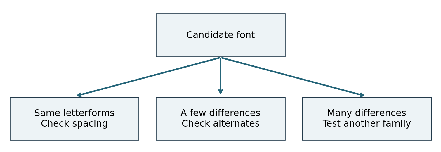
A diagnostic guide for comparing a candidate with a reference. Differences guide the next test; they do not prove a font’s identity.
Decide what actually needs to be custom
A fixed wordmark may need only a few carefully drawn letters. Repeated headlines in several languages create a different requirement: a working typeface with consistent spacing and character coverage. Commissioning an entire family for a single short name can add unnecessary work; redrawing each new headline by hand creates the opposite problem.
Write the brief around your own name. Specify where it must remain readable, which characters recur, and whether collaborators need editable text. A distinctive result comes from solving those requirements, not from reproducing a famous logo with one letter changed.
Clear the license before approving the artwork
Font identification and permission are separate questions. Before launch, check the agreement for the chosen file, the intended logo use, and the people who will install it. A downloadable font is not automatically cleared for commercial branding.
Planned use
Question to resolve
Public wordmark
Does the license explicitly cover logo use?
Editable brand templates
Who may install or receive the font files?
Live website text
What webfont coverage and limits apply?
Modified letters
Are artwork edits and font-file edits treated differently?
Campaign extensions
Are video, ads, apps, or merchandise covered?
TypeType lists a separate Logo license for creating and publicly using a logo, with pricing tied to the number of logos. Its Desktop FAQ permits changes to letterforms in a graphic editor but distinguishes these from modifying the font file itself. Confirm the applicable agreement; other foundries may organize these rights differently.
Converting text to outlines does not remove the need for the relevant permission. Keep the license record with the artwork and explain whether the client receives finished graphics, editable documents, or font files. Avoid passing along files simply because they were included in the designer’s working folder.
Finish with a proof, not just a font name
Before approval, place the wordmark in a small website header, on a plain document, and in a single-color version. These are practical tests, not universal minimum-size standards. Thin details that survive on a large presentation slide may disappear when reduced. Adjust the design or define a simpler small-size variant if necessary.
Deliver the final artwork with the original family name, chosen style, documented modifications, and licensing information. Keep an editable master and clearly named export files. The client should understand which asset is the fixed logo and which font can be used to create new communications.
A successful font search ends with an informed design choice. Sometimes the retail face is enough; sometimes an alternate or spacing adjustment solves the problem; sometimes custom lettering is justified. The evidence should determine the next step—and your own brand name should determine the final result.