
How to Choose a Font That Matches Your Brand Personality
May 18, 2026
How to Choose a Font That Matches Your Brand Personality
Typography is one of the most powerful yet overlooked elements of brand identity. The fonts you choose communicate volumes about your business before customers even read your content. Learning how to choose a font that matches your brand personality is essential for creating a cohesive, professional brand that resonates with your target audience and builds lasting recognition.
Your font choices influence how customers perceive your trustworthiness, professionalism, and values. A law firm using a playful, decorative font would seem unprofessional, while a children's toy company using formal serif typography might appear too serious. This comprehensive guide will walk you through the psychology behind font selection, practical pairing strategies, and best practices for creating a typography system that truly reflects your brand's unique personality.
Understanding Brand Font Psychology
The psychology behind typography runs deeper than most business owners realize. Every font category triggers specific emotional responses and associations that have been ingrained through decades of usage patterns and cultural context.
Serif fonts like Times New Roman, Georgia, and Playfair Display communicate tradition, authority, and reliability. These fonts feature small decorative strokes at the ends of letterforms, giving them a classic, established feel. They're perfect for brands that want to convey expertise, heritage, or premium quality. Law firms, luxury brands, academic institutions, and traditional businesses often leverage serif typography to communicate trustworthiness and credibility.
Sans serif fonts such as Helvetica, Futura, and Open Sans project modernity, cleanliness, and approachability. Without decorative serifs, these fonts appear streamlined and contemporary. They work excellently for tech companies, healthcare brands, modern startups, and any business wanting to appear forward-thinking and accessible.
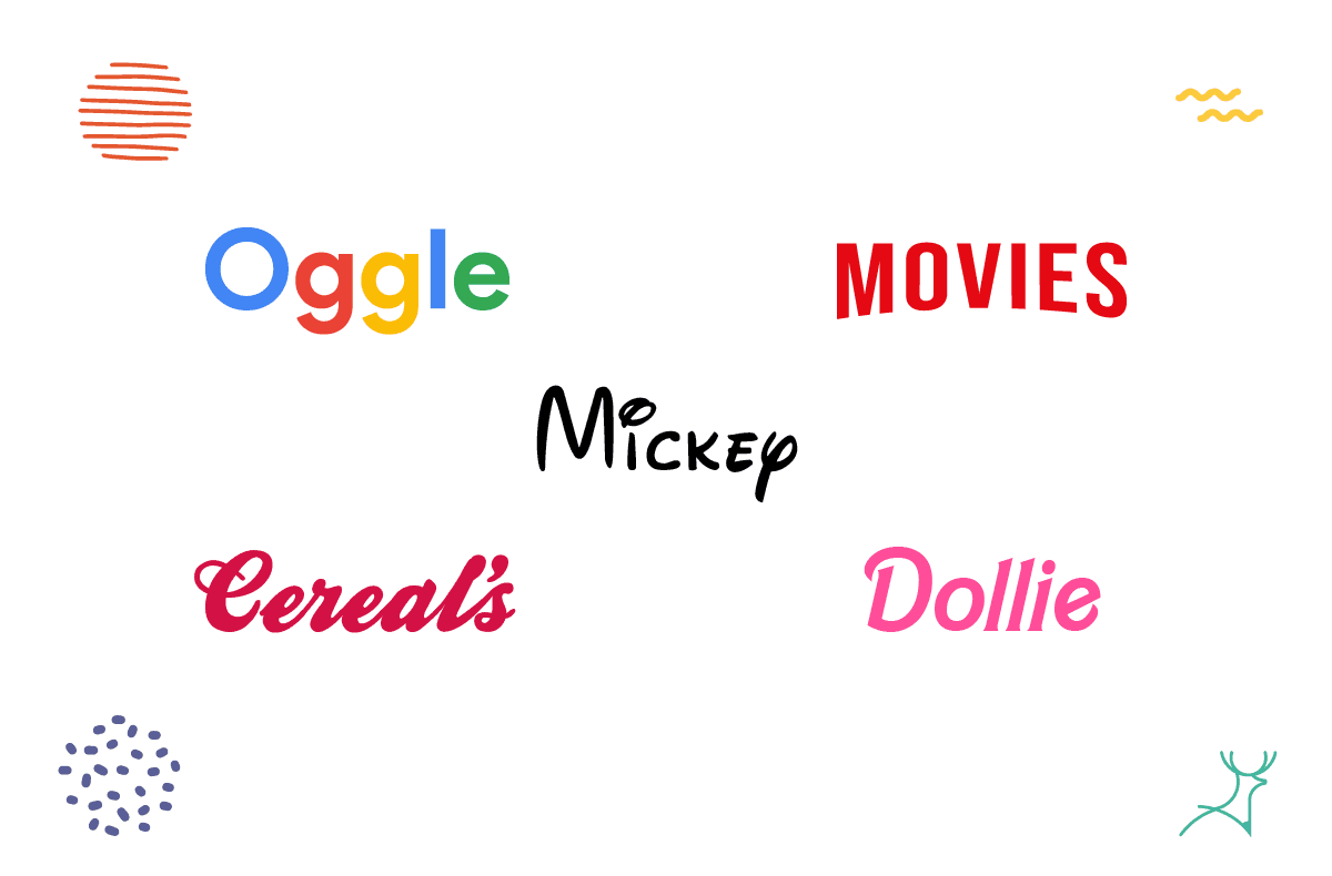
Script fonts evoke elegance, creativity, and personal touch. They range from formal calligraphy styles to casual handwritten looks. These fonts work well for luxury goods, creative services, wedding businesses, and brands emphasizing craftsmanship or personalization.
Display fonts are decorative typefaces designed to grab attention. They can communicate playfulness, innovation, or specific themes. While eye-catching, they should be used sparingly and primarily for headlines or logos rather than body text.
For a deeper dive into how different fonts trigger specific emotional responses, this comprehensive guide to font psychology explores the science behind typography's psychological impact on your audience.
Types of Fonts for Branding: Making the Right Choice
Understanding the different types of fonts for branding helps you narrow down options that align with your brand's core values and target audience expectations.
Traditional and Professional Brands
For established businesses, professional services, and brands emphasizing trust and expertise, serif fonts remain the gold standard. Consider fonts like:
- Minion Pro: Elegant and highly readable, perfect for premium brands
- Crimson Text: Strong personality with excellent digital readability
- Playfair Display: Luxurious feel ideal for high-end products or services
These fonts work particularly well for financial services, legal practices, educational institutions, and luxury brands where credibility and tradition are paramount.
Modern and Tech-Forward Brands
Contemporary businesses, especially in technology, healthcare, and innovative industries, benefit from clean sans serif typography:
- Montserrat: Versatile with multiple weights, excellent for digital applications
- Lato: Friendly yet professional, works across all brand touchpoints
- Source Sans Pro: Clean and highly functional, developed by Adobe for optimal screen reading
These fonts communicate efficiency, innovation, and accessibility while maintaining professional credibility.
Creative and Personal Brands
Businesses in creative industries, personal services, or lifestyle brands can leverage more expressive typography:
- Pacifico: Casual script that feels handwritten and approachable
- Amatic SC: Quirky sans serif with personality, great for creative businesses
- Dancing Script: Elegant script perfect for wedding planners, boutiques, or artistic services
However, ensure these fonts don't sacrifice readability for personality, especially in digital applications.
Font Pairing Tips for Brand Identity
Successful font pairing tips for brand identity involve creating hierarchy and visual interest while maintaining cohesion. The key is selecting fonts that complement rather than compete with each other.
The Primary + Secondary Approach
Choose one primary font for your logo, headlines, and main branding elements. Then select a secondary font for body text, subheadings, and supporting content. This approach ensures consistency while providing flexibility.
Winning Combinations:
- Playfair Display (headings) + Source Sans Pro (body): Classic elegance meets modern readability
- Montserrat (headings) + Georgia (body): Contemporary meets traditional for balanced appeal
- Oswald (headings) + Open Sans (body): Bold impact with clean readability
Contrast for Hierarchy
Effective font pairing relies on contrast to create visual hierarchy. Pair fonts from different categories serif with sans serif, condensed with extended, or heavy with light weights. This contrast guides readers through your content while maintaining visual interest.
Mood Consistency
While contrast is important, your font pair should share a similar mood or time period. Don't pair an ultra-modern geometric sans serif with a traditional Old Style serif. Instead, look for fonts that feel like they belong in the same design era or emotional space.
Brand Typography Best Practices
Implementing brand typography best practices ensures your font choices support rather than hinder your brand's success across all touchpoints.
Versatility is Essential
Choose font families that offer multiple weights (light, regular, bold, black) and styles (regular, italic, condensed). This versatility allows you to create hierarchy and emphasis without introducing additional fonts that might dilute your brand consistency.
Digital-First Considerations
In today's digital landscape, your fonts must perform excellently on screens. Test your choices across different devices, browsers, and screen sizes. Fonts that look beautiful in print might become illegible at small sizes on mobile devices.
Consider these digital optimization factors:
- Readability at 14px and smaller: Essential for mobile and web applications
- Letter spacing: Some fonts need adjustment for optimal screen reading
- Loading speed: Web fonts should load quickly to avoid impacting user experience
Licensing and Legal Considerations
Always verify licensing rights for your chosen fonts, especially if you're using them commercially. Free fonts from Google Fonts offer broad usage rights, while premium fonts may require specific licensing for different applications (web, print, logo usage). If you're looking for reliable, free font options, check out this curated collection of the best Google Fonts for 2025 which provides professionally vetted typefaces for commercial use.
Consistency Across Touchpoints
Your typography should work seamlessly across business cards, websites, social media, packaging, and signage. Test your fonts in various sizes and applications during the selection process to avoid costly redesigns later.
Choosing Fonts for Logos vs Body Text
The strategy for choosing fonts for logos vs body text differs significantly because these elements serve different purposes in your brand ecosystem.
Logo Typography Requirements
Logo fonts need to be:
- Distinctive: Memorable and unique enough to build recognition
- Scalable: Clear at both large (billboard) and small (favicon) sizes
- Timeless: Resistant to trends that might make your brand look dated
- Appropriate: Matching your industry and target audience expectations
Consider custom lettering or modified existing fonts for logos to ensure uniqueness and perfect fit with your brand personality.
Body Text Priorities
Body text fonts prioritize:
- Readability: Easy to scan and comprehend quickly
- Versatility: Multiple weights and styles for creating hierarchy
- Performance: Fast loading and rendering across devices
- Neutrality: Supporting rather than competing with your logo and headings
The best body text fonts become invisible to readers, allowing your content to shine without typographic distractions.
Creating Harmony Between Logo and Body Fonts
Your logo and body fonts don't need to match exactly, but they should feel harmonious. If your logo uses a distinctive script font, pair it with a clean, simple sans serif for body text. If your logo features a bold, geometric sans serif, consider a readable serif for longer content to create pleasing contrast.
Advanced Font Selection Strategies
Cultural and Industry Context
Different industries have established typography conventions that you can either embrace or strategically subvert. Financial services typically use conservative serif fonts, while tech startups favor modern sans serifs. Understanding these conventions helps you decide whether to fit in or stand out.
Consider your audience's cultural background as well. Some font styles may have different associations in different cultures or regions.
Testing and Validation
Before committing to fonts, test them with real content and actual users. Create mockups of your website, business cards, and marketing materials to see how the fonts perform in context. Consider A/B testing different font combinations to measure their impact on engagement and conversion.
A smart move here is to think about your overall CRO strategy. Instead of randomly testing fonts and hoping for the best, a clear CRO strategy helps you prioritize what to test, why it matters, and how it ties back to your business goals. With the right CRO strategy, you can align design choices with real user data, making sure every tweak improves engagement and actually lifts conversions
Future-Proofing Your Typography
Choose fonts that will age well with your brand. While trendy fonts might seem appealing, they can quickly make your brand appear outdated. Focus on fonts with strong fundamental design principles rather than those riding current design trends.
Common Font Selection Mistakes to Avoid
Over-Decoration
Many businesses choose fonts that are too decorative or complex, sacrificing readability for perceived personality. Remember that your font should enhance your message, not overshadow it.
Ignoring Technical Limitations
Selecting fonts without considering web loading times, print reproduction quality, or small-size legibility can create practical problems that force expensive brand redesigns.
Following Trends Blindly
Typography trends come and go, but your brand needs consistency over years or decades. Choose fonts based on your brand personality rather than current design fashions.
Using Too Many Fonts
Stick to two to three fonts maximum across your entire brand. Too many fonts create visual chaos and weaken brand recognition.
Implementing Your Typography System
Creating Brand Guidelines
Document your font choices in comprehensive brand guidelines that specify:
- Primary and secondary fonts with usage rules
- Hierarchy specifications (heading sizes, spacing, etc.)
- Color applications and contrast requirements
- Dos and don'ts for each font application
Team Training and Tools
Ensure everyone creating brand materials understands your typography system. Provide templates and tools that make it easy to maintain consistency across all brand touchpoints.
Regular Audits and Updates
Periodically review your typography across all brand applications to ensure consistency and effectiveness. Technology changes and brand evolution may require minor adjustments to keep your fonts performing optimally.
Measuring Typography Success
Track metrics that indicate whether your font choices support your brand goals:
- Brand recognition: Do people remember and recognize your brand?
- Readability metrics: Website time on page, bounce rates, and engagement
- Conversion rates: How do different typography treatments affect business outcomes?
- Brand perception surveys: Do your fonts convey the intended personality?
Conclusion
Learning how to choose a font that matches your brand personality is both an art and a science that requires careful consideration of psychology, practicality, and brand strategy. The right typography system becomes an invisible yet powerful asset that reinforces your brand message, builds recognition, and creates emotional connections with your audience.
Remember that great typography choices compound over time. Consistent, thoughtful font selection builds brand equity and recognition that becomes increasingly valuable as your business grows. Take time to choose fonts that truly represent your brand's personality while serving the practical needs of your business and customers.
Your fonts are working 24/7 to communicate your brand values make sure they're telling the right story. By following the strategies and best practices outlined in this guide, you'll create a typography system that not only looks professional but actively supports your business goals and brand success.
