
Student Council Logo Trends: Minimalism, Mascots, and Meaning
March 17, 2026
Student councils are giving their brands a major glow-up. Across campuses, their visuals are now sharper, cleaner, and more creative. A logo has become the face of student leadership, showing off pride, energy, and culture.
To see what's driving this change, our Essay Writers team studied 200 student council logos from 2020 to 2025 across 15 countries. We looked at their styles, colors, and symbols. We also talked with 15 student designers about what shaped their work.
The project was run with the help of our design researchers, who mapped patterns and tracked how these logos evolved. The results revealed three big trends shaping council branding today: minimalism, mascots, and meaningful symbolism.
How We Gathered Data
We reviewed 200 student council logos from websites, social media, and brand kits. Each was coded for:
- Style (minimalist, detailed, vintage)
- Motif (mascot-based, symbolic, abstract)
- Color palette (school colors, monochrome, multi-color)
- Typography (serif vs. sans-serif, monograms)
- Shape and layout (horizontal, stacked, circular)
We also spoke with 15 student designers.
Michael Perkins, who heads a team of design-focused essay writers at EssayWriters, sees a major trend: over half of the councils we studied had redesigned their logos within the past three years, and almost 70% simplified their visuals to improve social media impact.
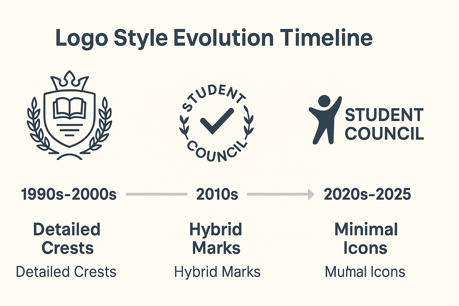
The Rise of Minimalism in Student Council Logo Design
Minimalism is the leading look right now. About 58% of the logos we saw used flat design, clean typefaces, and bold geometric shapes.
These logos center on big initials, simple icons, and solid colors that stay crisp at any size. The University of Canberra SRC used its acronym in university blue with a clean horizontal layout. The University of Bath SU added bright block shapes around a blue wordmark for a modern, fun look.
"We wanted something that looks fun, not like a government office," said Hana M., a student designer from Sydney.
Minimalist logos stand out on screens, print well on merchandise, and align with how students expect modern brands to look.
Mascots and School Spirit in Modern Logos
Mascots are still popular when councils want a strong school identity.
About 27% of the logos we reviewed used mascots or athletic symbols, especially in North America. Mascots used to be detailed cartoons, but now appear as clean icons, like a hawk's head or a tiger's silhouette.
"We wanted a design people would wear on hoodies, something that felt like a cool student council logo," said Liam S., a U.S. student council president.
Mascots bring instant recognition, spark pride, and work well on merchandise.
Symbolism at Work – Icons That Carry Meaning
Symbols are growing fast in council branding.
About 31% of the logos used abstract or symbolic elements. Torches signal leadership, books represent knowledge, laurels show achievement, and stars hint at ambition.
Trinity College Dublin's SU logo is a strong example. It shows a cube-shaped house (their historic building "House 6") with bilingual acronyms on the sides.
Designers often build their whole system around one symbolic icon, then add color and text versions for different uses.
Logo for Student Council Types by Share (2020-2025)
Logo Type
Share of Logos
Key Features
Minimalist
58%
Flat icons, sans-serif type, geometric shapes
Mascot-based
27%
Animal or athletic symbols, school spirit focus
Symbolic/abstract
31%
Torches, books, laurels, campus landmarks
Traditional crests
12%
Shields, mottos, heraldic details
Hybrid styles
18%
Combines symbols/mascots with a modern layout
Some councils mix styles, like using a mascot icon with a minimalist wordmark.
Tradition Reimagined – Blending Old and New
Around 12% of councils still use crest-style logos, usually at older universities.
These logos borrow shield shapes, wreaths, mottos, or parts of the university's coat of arms. They show heritage and continuity.
Many have recently been simplified: dropping Latin mottos, flattening colors, and cleaning up shapes. Some now use the full crest only for formal settings like graduation banners, while using simpler logos for social media and student events.
This balance honors history while staying relatable to today's students.
Color & Typography Choices Driving Impact
Color and type are what make a logo stick.
Color trends:
- Bright tones like electric blue, lime, and orange for energy
- School colors for familiarity
- Monochrome backups for dark backgrounds or merch
Typography trends:
- 87% of our sample used sans-serif fonts for easy reading
- Many played with monograms and custom initials
Design teams brainstorming student council logo ideas often start with one standout color, a clear font, and a shape that works across screens and print.
Adapting Logos for Multi-Platform Use
Councils now design logos to work everywhere.
A typical student logo design includes:
- A horizontal layout for websites
- A stacked or square layout for social media
- An icon-only version for app icons and tight spaces
They also create full style guides with color codes, spacing rules, and alternate versions. This keeps their look consistent on banners, flyers, and hoodies.
Regional Differences and Global Common Ground
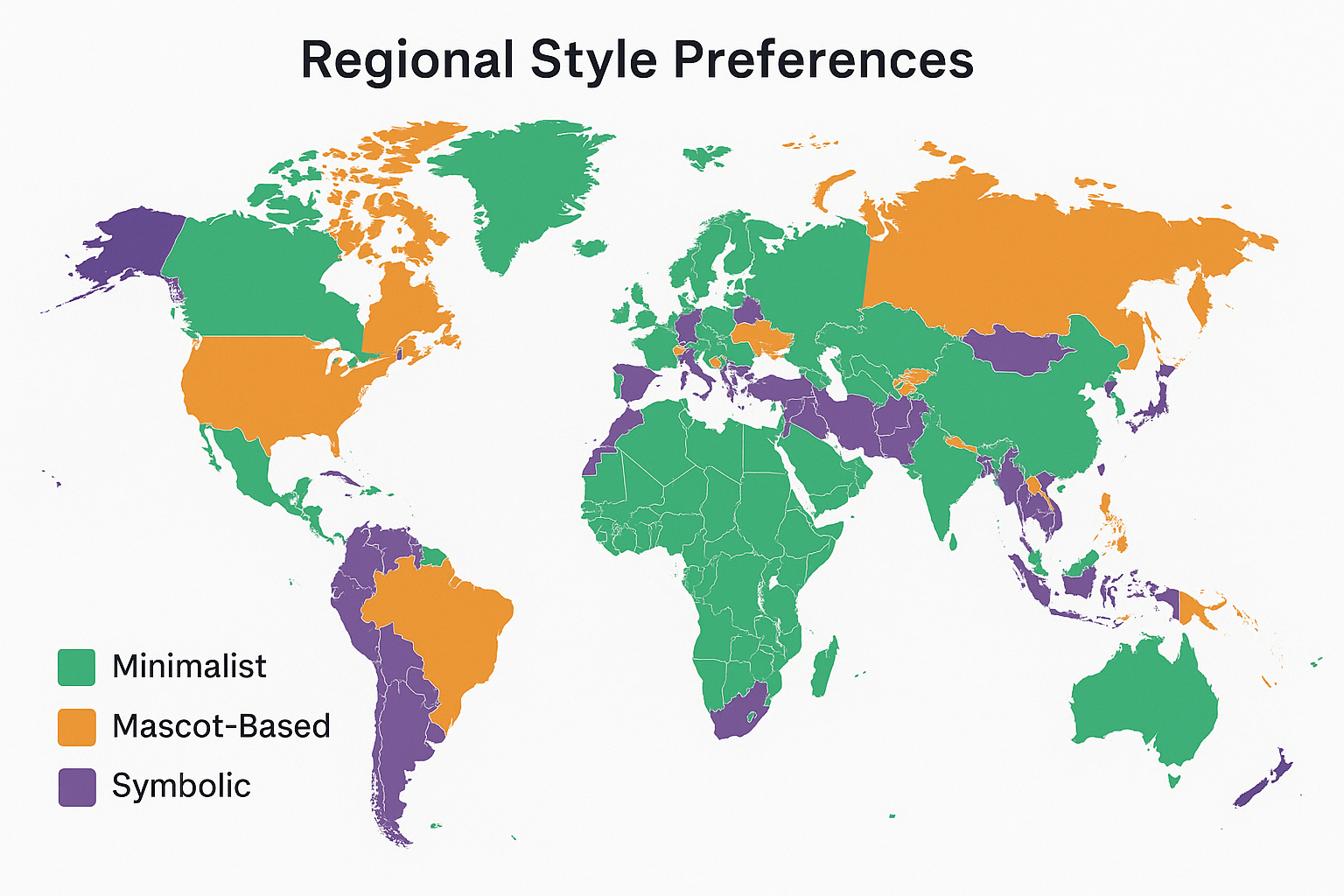
North America favors mascots, bold fonts, and sports-style branding.
The UK and Ireland prefer minimalist wordmarks, bright colors, and bilingual names.
Asia and Oceania blend minimalism with local motifs or calligraphy.
Africa and the Middle East are moving from detailed crests to simple geometric icons.
Despite differences, most regions are heading toward clarity, youth appeal, and flexibility.
What This Means for Future Rebrands
Future councils will likely build modular visual systems – a central logo for student council with color-coded sub-brands for services and events.
We're seeing experiments with icon sets, motion graphics, and cultural references from student life.
"Students want something that reflects who they are right now and still looks good five years from now," said Ava R., a London-based design lead.
In Closing
Student council logos are getting simpler, bolder, and more expressive.
They show pride, unity, and modernity in a way students connect with fast. These logos work on everything from Instagram posts to graduation banners, which creates consistent identity.
If your council is planning a redesign, focus on three things: simplicity, meaning, and versatility. A strong logo can outlast your term and become part of campus culture.
