
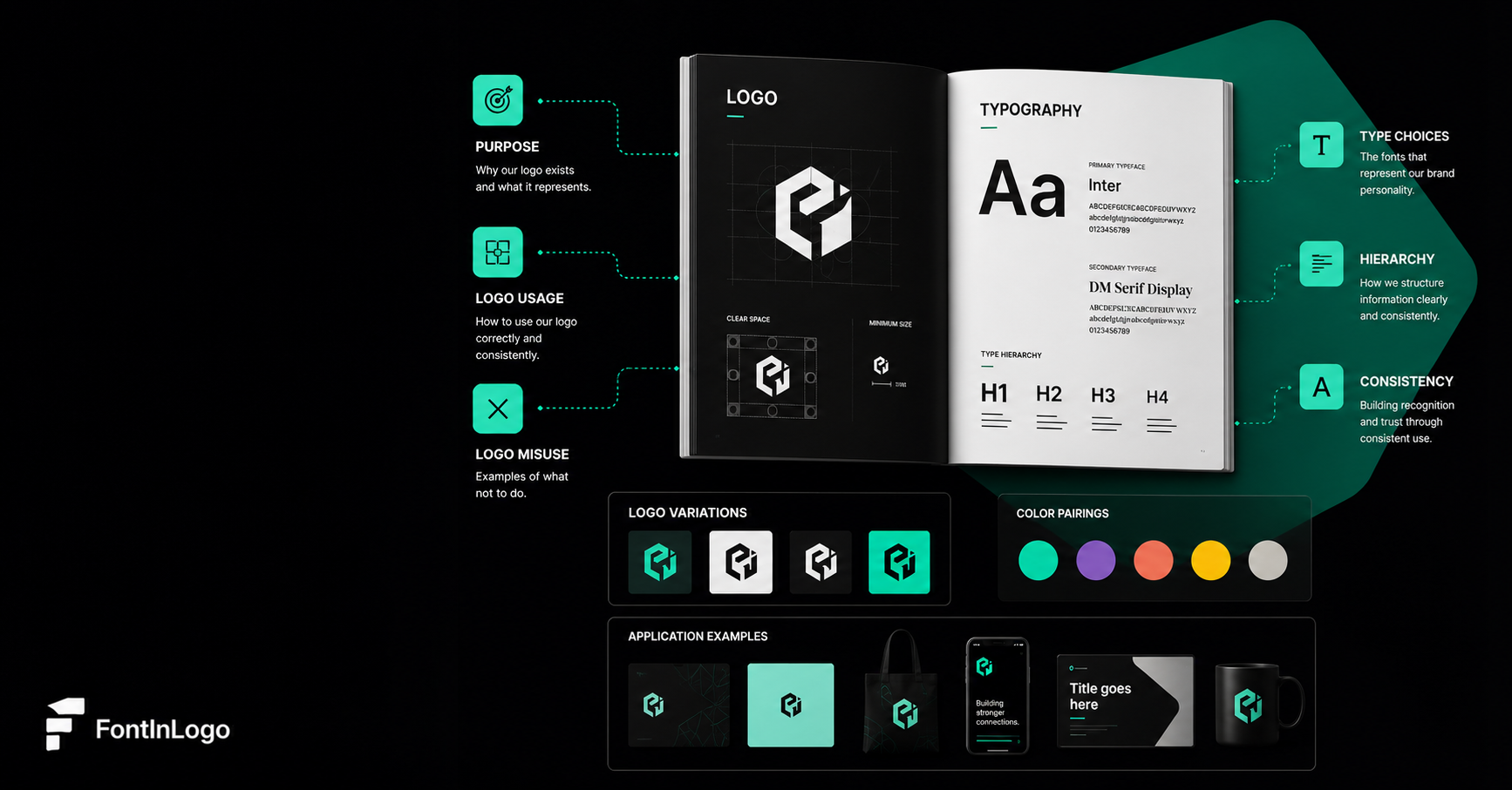
Brand guidelines have become a key reference point for companies managing visual identities across digital and physical platforms in 2026. This article examines how brand books define logo usage, typography choices, and application rules for consistent communication. According to a 2024 Adobe study, 73% of consumers said consistent brand experiences influence their purchasing decisions. Clear documentation helps design teams, agencies and businesses apply visual elements accurately across different formats and channels.
Logos and typography remain two of the most recognisable components of a brand identity. A logo creates a visual symbol that audiences can associate with a company, while typography influences how messages appear and feel. Together, these elements establish a framework for communication that extends beyond individual marketing campaigns.
A brand identity is not built through a single design choice. It develops through repeated exposure to consistent visual elements, including colours, fonts, imagery and layouts. When these components work together, they create familiarity across websites, packaging, advertising materials and social platforms. Research from the Nielsen Norman Group has found that users often form an impression of a website within a fraction of a second. While visual identity represents only one factor in audience perception, the finding highlights why businesses carefully consider how their digital presence appears from the first interaction.
For this reason, brand books have become more than collections of design assets. They document the decisions behind a visual identity and establish standards that help maintain consistency over time.
The Role of a Logo Within a Brand System
A logo often acts as the central visual marker of a brand, but modern identity systems usually include several variations designed for different applications. A full logo may work effectively on websites or printed materials, while a simplified icon can support smaller formats such as mobile applications or social media profiles.
Brand guidelines should explain how these versions relate to each other and when each variation should appear. Clear rules around sizing, spacing and placement reduce the risk of inconsistent use across different platforms.
Many guidelines also include examples of incorrect applications. These examples may show how logos should not be stretched, recoloured or altered, helping teams protect the original design.
Accessibility has also become an important consideration for digital branding. According to the Web Content Accessibility Guidelines from the World Wide Web Consortium, sufficient colour contrast improves readability for users with visual impairments. Logo applications should consider visibility across different backgrounds and environments.
How Brand Guidelines Should Present Logo Usage
Effective logo guidelines communicate rules through practical examples rather than relying only on written explanations. Designers often include approved layouts, spacing requirements and colour specifications to show exactly how the logo should appear.
Clear guidance becomes particularly important when multiple teams contribute to brand materials. Internal departments, agencies and external partners may all create content using brand assets, making consistency harder to maintain without shared standards.
A detailed section on logo usage usually covers minimum size requirements, protected space around the logo and approved background combinations. These details help prevent variations that could weaken recognition.
Modern brands also need guidelines that work across a wide range of channels. A logo designed for a billboard must also function on a smartphone screen, within an app interface or as a social media profile image. Flexible systems allow brands to adapt without losing their visual identity.
Defining Logo Variations and Application Rules
A strong brand book brings together the essential elements needed to represent a company visually, including logo specifications, typography choices, colour palettes and examples of correct usage. Brand guide resources describe these documents as references that explain how organisations should apply visual elements consistently across marketing and communication materials.
The purpose of a brand book is not only to store design files. It provides context around why certain decisions were made and how teams should use those decisions when creating new content.
Typography sections within these documents are especially important because fonts influence readability, tone and recognition. A typeface can make a brand appear traditional, innovative, professional or approachable depending on its characteristics.
According to Monotype’s 2024 Brand Voices report, 77% of consumers believed typography influences how they perceive a brand. The research highlights the connection between font selection and audience interpretation, showing why typography requires the same level of consideration as logo design.
Brand books commonly outline primary and secondary typefaces, recommended sizes, spacing rules and examples of hierarchy. These details help ensure that headlines, body text and digital interfaces maintain a consistent appearance.
Building Guidelines That Support Long-Term Consistency
The most effective brand books balance clear rules with room for adaptation. A rigid system may limit creative applications, while a vague one can lead to inconsistent results. Design teams increasingly focus on explaining the reasoning behind visual decisions. Understanding why a logo requires specific spacing or why certain fonts are paired together allows others to make informed choices when creating new materials.
Consistency does not mean every brand interaction looks identical. Instead, it means each application follows the same underlying principles. This approach allows businesses to maintain recognition while adapting to changing platforms and communication needs.
Creating a Strong Foundation for Brand Recognition
Logos and typography continue to shape how audiences identify and interpret brands. By documenting their use through clear guidelines, companies can create a shared reference point for designers, marketers and partners.
A well-developed brand book supports consistency while allowing visual identities to develop over time. As brands communicate across more platforms, these documents remain an important tool for maintaining clarity, recognition and design quality.
