
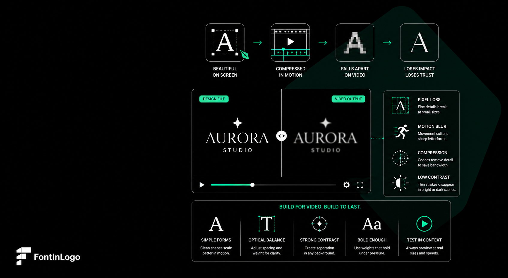
Most brands can tell you their logo font in one sentence. Ask what happens to that font once it lands in a video, and the answer gets murkier fast.
I've spent enough time picking apart brand typography to know the pattern: a company locks down its wordmark, gets the kerning right, picks a solid pairing for the website, and then the video team builds captions in whatever the editing software defaults to. Nobody signed off on that font. Nobody checked whether it clashes with the logo that appears two seconds later in the same clip. It just happened, because video moves faster than brand review usually can.
The Logo Is Not the Whole Typeface System
Here's the part people miss. A logo font and a brand's working typeface are often two different things, and that's by design. Netflix doesn't run its logotype across every subtitle and lower-third — it uses Netflix Sans for that, a workhorse face built to hold up at small sizes and high volume. Spotify's circular wordmark isn't what shows up in their in-app text either. The logo is a fixed mark. The supporting font is what actually gets used, over and over, in places the logo can't go: captions, overlays, end cards, ad copy.
Video is exactly the environment where that supporting font gets tested and, frequently, ignored. A caption tool ships with a default sans. A freelance editor picks something that "looks close enough." Multiply that across a hundred video variants for different regions and platforms, and a brand can end up with a dozen different fonts standing in for one identity, none of them the one that was actually chosen.
Why This Gets Worse at Scale, Not Better
Small teams catch this by accident — one person is doing the editing, and they know the brand fonts because they picked them. The problem shows up once video production scales past a single person's memory. Regional marketers producing localized cuts. Freelancers brought on for a campaign push. AI tools generating dozens of variants for testing. Each one is a new opportunity for the wrong font to slip into a caption, a title card, or a CTA overlay.
This is the same failure mode that shows up in logo design generally, just compressed into a faster production cycle. A stale font file gets pulled from an old brand folder. Someone eyeballs a "close enough" system font because licensing the real one wasn't set up for that tool. A localized version swaps in a font that supports the target language but was never checked against the brand's actual type hierarchy. Each choice looks minor. The cumulative effect is a brand that reads differently depending on which video you happen to be watching.
What Actually Fixes It
The solution isn't a stricter memo. It's making the font a fixed input rather than a judgment call — something that gets loaded into the production tool the same way a logo file does, instead of re-selected from scratch by whoever's editing that day.
That's effectively what a proper brand kit video editor is for. Instead of leaving font choice to whoever's cutting a given video, the typeface, weights, and color palette live inside the editing platform itself, alongside the logo placement rules, so every export pulls from the same source instead of a fresh guess. Load the brand's actual caption font once, and it's applied automatically to every variant generated afterward, rather than being reintroduced by hand each time.
For teams producing video at real volume, this matters more than it sounds like it should. A brand kit built into the editor closes the same gap that a documented style guide is supposed to close on the design side, except it enforces it instead of just recommending it. The font doesn't drift because there's no step where drift can happen.
A Quick Gut-Check for Your Own Videos
Pull up your last five video ads or social clips side by side. Are the captions using the same font in all of them? Does the type in your lower-thirds match what's on your website, or does it just resemble it? If a regional team produced one of those videos, does the localized version still look like it came from the same company as the original?
If you're not sure, that's worth fixing before it compounds. Video output only grows from here, and every unchecked font choice made now gets copied into every variant made after it.
The Bigger Point
A logo is a single, carefully considered mark. The font behind it is a system that has to survive constant reuse, and video is where that system gets stress-tested the hardest, because video moves fast, gets localized, and increasingly gets produced by tools rather than a single trained eye. Knowing your brand's actual typeface, not just its logo, is the first step. Making sure every tool touching your video actually uses it is the one most brands skip.
