Why Website Performance Depends on More Than Just Good Design?
A site can look perfect in a mockup and still feel slow. Here is how fonts, images, scripts, hosting and trust shape real website performance.
November 18, 2026
A site can look perfect in a mockup and still feel slow. Here is how fonts, images, scripts, hosting and trust shape real website performance.
November 18, 2026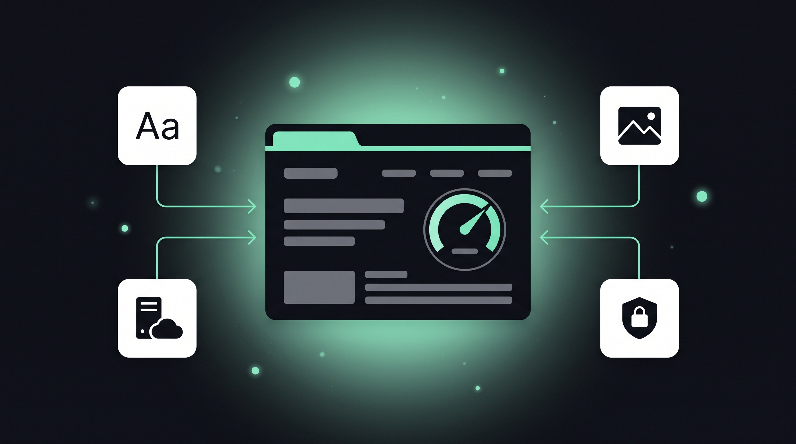
A website can look perfect in a design file and still frustrate the people who use it. Clean typography, a strong logo and a considered color palette are what visitors notice first. They don’t keep anyone on the page, though. Speed, stability, how the site handles a weak connection and whether people trust it all affect the experience, and you can’t see any of them in a mockup.
This matters for designers and brand owners because many of the things that slow a site down start as design choices.
Visitors judge visual design almost instantly. The next few seconds are about performance. If the hero image loads in strips, the text jumps when a font swaps in, or a button ignores the first tap, the polished look stops counting. People remember being annoyed. They don’t remember the palette.
Google measures part of this with Core Web Vitals. Largest Contentful Paint tracks how quickly the main content shows up. Interaction to Next Paint tracks how fast the page responds to clicks and taps. Cumulative Layout Shift tracks how much the layout moves while it loads. All three are part of Google’s page experience signals, so a slow, unstable page can lose search visibility as well as visitors.
Custom web fonts are one of the most common reasons a well-designed page feels slow.
Each weight and style of a typeface is usually its own file. Say a design uses a display face for headings, a body font in regular, italic, semibold and bold, and an icon font. The browser may have to fetch six or more files before the text looks right. While they load, it either hides the text or shows a fallback and swaps it out later, and that swap can shift the whole layout.
A few habits help a lot:
font-display: swap or optional so text shows right away.size-adjust, so the swap causes less movement.A typeface that looks great but holds up the whole page isn’t a good choice for the web, however well it fits the brand.
Full-width hero images, autoplaying background videos, sliders and animation libraries all add bytes and scripts. None of them are banned, but each one has a cost.
Use modern formats like WebP or AVIF for photos. Size images for the screens that will actually show them. Lazy-load anything below the fold, and always set width and height on images so the browser can reserve space before they arrive. Logos and icons should usually be SVG. They stay sharp at any size and the files are tiny compared to a high-resolution PNG.
A light theme doesn’t make a light site. Hosting quality, server response time, caching and whether you use a CDN all affect load times before the design even comes into it.
Third-party scripts are usually the bigger problem. Chat widgets, analytics tags, ad scripts, social embeds and marketing pixels each add requests, and some block the page while they load. Sites tend to collect these over time without anyone checking whether they’re still needed. A regular audit, removing anything nobody uses, often does more than a redesign would.
When you test on your own laptop over a fast office connection, you’re seeing the best case. Someone in another country may be served from a different CDN edge, see a different cookie consent banner, get redirected by geo-based rules, or have certain third-party resources blocked.
Browser developer tools can simulate slower networks, which covers part of this. To see the site the way visitors in other regions do, a VPN extension for Firefox lets you change location from the browser and check load behavior, redirects and localized content without leaving your normal workflow. It also encrypts your traffic when you log into a site’s admin area over public Wi-Fi. One caveat: a VPN adds its own latency, so use it to compare regions against each other, not to measure absolute load times.
A site that triggers a browser security warning loses visitors no matter how good it looks. HTTPS should be standard, mixed content (HTTP resources on an HTTPS page) should be fixed, and the CMS, theme and plugins should stay updated. Outdated plugins are both a security risk and a common source of slow, bloated code.
Several free tools show where a site actually stands:
Lab results and real-user data often disagree, and the real-user numbers are closer to what visitors experience. Check both after every redesign, plugin install or new tracking script.
Good design gets people’s attention. Performance decides whether they stay long enough to see it. If you treat font loading, image weight, and third-party scripts as part of the design brief, and not as something to clean up after launch, you won’t have to pick between a site that looks good and one that works well.