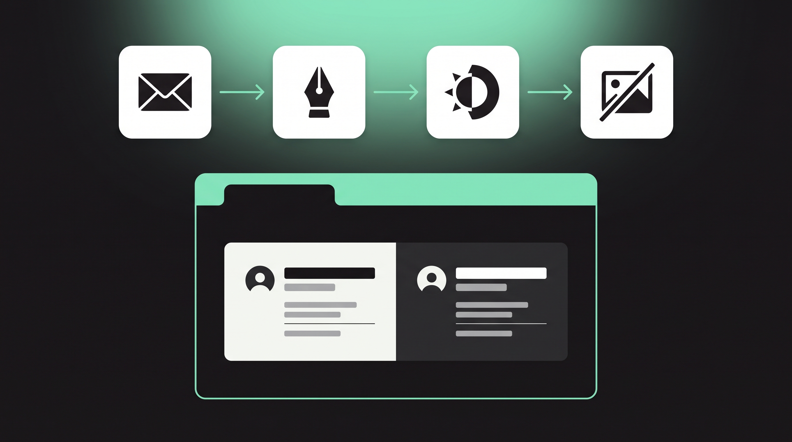
We spend a lot of time perfecting any project, from the logotype, kerning trials, favicon variants, and optical corrections to a brand book that hardly gets opened twice. After brainstorming and pushing the project to its highest-frequency touchpoint, we end it with a block of default Calibri and a headshot pasted into a 400-pixel-wide email signature. An email signature is perhaps the most widely used material for any brand, but hardly any organization thinks of redesigning it in a new way.

The email signature is inherited like a legacy and stays the same no matter who sets up the email, until it stops rendering properly. The question is not how it appears in Figma, but how it looks in Outlook on Windows in dark mode with images blocked, after being replied to four times. Designing email signatures comes with constraints, and designers who understand these environments can produce professional sign-offs while others just create something irrelevant.
The Support Matrix Is the Brief
A sign-off doesn’t have a universal canvas, and it appears differently across email clients, operating systems, and email accounts. Apple Mail renders content similar to a browser with system fonts available, Gmail on the web removes a few things and shortens long messages, and Outlook on the desktop renders using Word, which causes issues with margins and floats and treats your perfectly spaced and arranged divs as a potential enemy.
The practical approach is to design for the email client, using the same constraints print designers learned decades ago: design with the worst render in mind, aim for what works in the most clients, and use tables for layout, inline styles, readable sizes, and no complicated design that shows off unnecessary creative skill.
Before finalizing any typeface, check how it appears on the email clients your audience uses. Can I email has support tables that help you look up whether a technique works across all clients, including Gmail, Apple Mail, and Outlook.
Design for the Fallback, Not the Dream
Web fonts may be a progressive enhancement, but many corporate proxies block them, and Outlook on the desktop doesn’t support them at all, which makes the font stack the most important place to design. You are not just choosing a typeface but also its alternatives, so make sure that if the font you are sending is unsupported or unavailable, the signature still looks appealing. To design such a sign-off, list your primary font first, followed by its fallback fonts, and compare both renderings side by side at real display size, because x-height, weight, and tracking can change with each substitution.
The safest professional choices are often the boring ones, like a system sans with strong screen metrics or a transitional serif with a generous x-height. If licensing is the issue, which is often the most common concern, choose a well-made open family with clear terms from the Google Fonts library, so every employee can use it in their outgoing mail. When a sign-off is designed with too many decorative elements, it becomes evident that someone designed just the logo and ignored the rest of the communication.
Hierarchy Beats Decoration
A signature has five main jobs, in this order: name, role, company, one action, and one legal line. Anything that doesn’t serve one of those purposes is just decoration, and at thumbnail size it steals all the attention. To prevent this, create hierarchy with weight and size rather than with lots of color shades and lines. Build the signature in the same order, with the name in bold, the role smaller and regular, the company contact smaller still, and the legal fine print subtle but not invisible.
The headshot should serve the same purpose. It is extremely helpful when the sender’s identity matters, such as for product leads, founders, consultants, and account leads. It should be exported as a square at proper resolution and rendered at half size for high-density screens. For other employees, a headshot doesn’t bring much value and only adds file size and another piece of alt text to maintain.
Blocked Images Are the Default State
Many email clients block images by default, and when that happens, your beautifully designed banner turns into a gray box or a broken icon with no text. Logos should also come with a text version, because if the logo is blocked along with the other images, it communicates nothing. Alt text is not just an accessibility feature but a copy strategy that keeps communicating when images fail to display.
Dark Mode Is a Contrast Brief
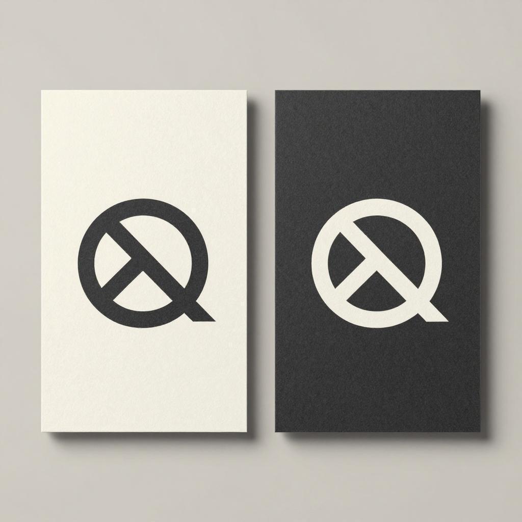
Dark mode changes the email interface, but it doesn’t adjust your images. A black wordmark on a transparent background becomes invisible in a dark pane, while a white one may look too bright. The solution is practical rather than decorative: proper padding, colors that work on both backgrounds, no pure black-and-white raster exports, and headshots that don’t depend on a white background.
Contrast is a functional requirement, not merely a matter of appearance, and the guidelines collected by the W3C Web Accessibility Initiative apply clearly here. Before shipping, test the sign-off in both light and dark modes. Otherwise, a design problem can go unnoticed because it was only viewed in one mode.
Rollout Is an Ops Problem Wearing a Design Costume
Good design usually dies when no one owns the signature. In an organization of fifty employees, you can find forty-three different configurations, with interns making their own sign-offs because there is no standard template. Centralized management, server-side injection, or a deployment tool is the only practical way to maintain consistency as the organization grows. A professional email program on your own domain makes this possible, so version-controlled signatures can be deployed across the organization instead of employees using their own versions.
Operations should manage the deployment, and the design team should manage the signature. The handoff document should be two pages explaining the font stack, fallback fonts, dark mode rules, and alt text conventions. Then comes maintenance: run an audit every quarter to kill legacy variants, and treat rogue sign-offs the way you would treat an unapproved logo lockup.
Sign-offs may not get recognition or win awards, but people will see them thousands of times, far more often than they will read your case study. A signature must work under the worst rendering conditions, and that is why a designer is non-negotiable. Maintaining consistency at that frequency is not about pride. It is the brand taking care of its image even when no one is paying attention.